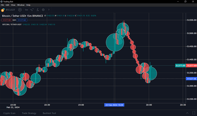
Hello, how are you? I’m trying to create a new type of circle chart that represents the difference between the opening and closing price (I wanted to do it with the volume but it seems to be more difficult) I thought that by putting an array in the size of the mark With the difference between the opening and closing it would remain but it is not working, the circles have a different size as seen in the image, in addition to the fact that when zooming or dragging the graph the size of the circles does not adapt to the measurements of the plotting area , at the moment the only solution I see and that I have not yet tried is to calculate how much 1px is equivalent to in the current measurements of the yaxi using the following formula:
layer._fullLayout.yaxis.p2c(0)-layer._fullLayout.yaxis.p2c(1) and divide the difference between the opening and closing with the result to know what the size of each circle is in pixels and thus create an array with each of the values, the problem I see is that I would have to calculate the array every time the graph is dragged or zoomed and also in each update of the price since this also constantly changes the plotting area, is there any How to make it automatic without so much calculation?

