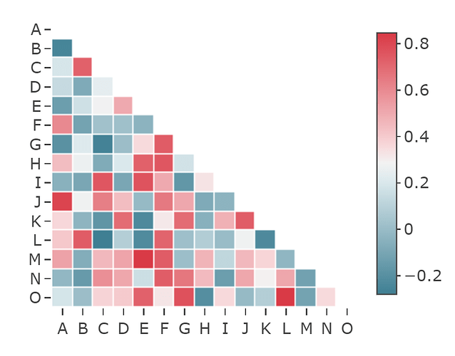
Correlation plot with mask

Hi Community,
is there a way to create in python a correlation graph (using pandas.DataFrame.corr) with a ‘mask’ or some other option, so the output looks like the image below (created using seaborn) with the following code:

mask = np.zeros_like(corr, dtype = np.bool)
mask[np.triu_indices_from(mask)] = True
cmap = sns.diverging_palette(220, 10, as_cmap = True)
f, ax = plt.subplots(figsize=(30, 10))
ax = sns.heatmap(corr, mask = mask, cmap = cmap, vmax = 1,square = True,
linewidths = .5, cbar_kws = {“shrink”: .5}, ax = ax)
plt.show()

Thanks
Rom

image

1 Like

Hi @romal,

You can plot a correlation matrix as a Plotly heatmap. If the correlation matrix is a list of lists, insert None in the upper triangular part (see the code below), while if it’s a numpy array, set those values on np.nan.

I tried to reproduce your correlation, setting all attributes that lead to a similar plot.
Note, that it’s important to set yaxis_autorange='reversed', because otherwise your matrix isn’t lower triangular. (this setting is equivalent with numpy.flipud(corr))

import numpy as np
import plotly.graph_objects as go
import plotly.io as pio
pio.templates.default = "none"


N = 15
corr = [[-0.3+ 1.15 * np.random.random() if i>j else None for j in range(N)] for i in range (N)]

labels = 'ABCDEFGHIJKLMNO' 
X = [labels[k] for k in range(N)]
hovertext = [[f'corr({X[i]}, {X[j]})= {corr[i][j]:.2f}' if i>j else '' for j in range(N)] for i in range(N)]
sns_colorscale = [[0.0, '#3f7f93'], #cmap = sns.diverging_palette(220, 10, as_cmap = True)
 [0.071, '#5890a1'],
 [0.143, '#72a1b0'],
 [0.214, '#8cb3bf'],
 [0.286, '#a7c5cf'],
 [0.357, '#c0d6dd'],
 [0.429, '#dae8ec'],
 [0.5, '#f2f2f2'],
 [0.571, '#f7d7d9'],
 [0.643, '#f2bcc0'],
 [0.714, '#eda3a9'],
 [0.786, '#e8888f'],
 [0.857, '#e36e76'],
 [0.929, '#de535e'],
 [1.0, '#d93a46']]

heat = go.Heatmap(z=corr,
                  x=X,
                  y=X,
                  xgap=1, ygap=1,
                  colorscale=sns_colorscale,
                  colorbar_thickness=20,
                  colorbar_ticklen=3,
                  hovertext =hovertext,
                  hoverinfo='text'
                   )


title = 'Correlation Matrix'               

layout = go.Layout(title_text=title, title_x=0.5, 
                   width=600, height=600,
                   xaxis_showgrid=False,
                   yaxis_showgrid=False,
                   yaxis_autorange='reversed')
   
fig=go.Figure(data=[heat], layout=layout)        
fig.show() 

2 Likes

First, thanks so very much for the prompt reply.
and even more so for the great solution …
based on your example i used the following to prepare the pd correlation ouput:

mask = np.zeros_like(corr, dtype = np.bool) #probably could do this on df… to check
mask[np.triu_indices_from(mask)] = True
corr1=corr.mask(mask)

Then plot:
X = corr1.columns.values
sns_colorscale = [[0.0, ‘#3f7f93’],
[0.071, ‘#5890a1’],
[0.143, ‘#72a1b0’],
[0.214, ‘#8cb3bf’],
[0.286, ‘#a7c5cf’],
[0.357, ‘#c0d6dd’],
[0.429, ‘#dae8ec’],
[0.5, ‘#f2f2f2’],
[0.571, ‘#f7d7d9’],
[0.643, ‘#f2bcc0’],
[0.714, ‘#eda3a9’],
[0.786, ‘#e8888f’],
[0.857, ‘#e36e76’],
[0.929, ‘#de535e’],
[1.0, ‘#d93a46’]]
heat = go.Heatmap(z=corr1,
x=X, #check direct df column use
y=X, #check direct df row/index use
xgap=1, ygap=1,
colorscale=sns_colorscale, #“Magma”
colorbar_thickness=20,
colorbar_ticklen=3,
zmid=0 #added

hovertext =hovertext,

hoverinfo=‘text’

               )

title = ‘Correlation Matrix’

layout = go.Layout(title_text=title, title_x=0.5,
width=800, height=800,
xaxis_showgrid=False,
yaxis_showgrid=False,
yaxis_autorange=‘reversed’)

fig=go.Figure(data=[heat], layout=layout)
fig.show()

producing desired output:

one additional quick question…
what are these lines for? :
import plotly.io as pio
pio.templates.default = “none”

again many thanks
Rom
P.S.
really enjoying exploring how to use plotly

@romal Plotly has a few layout templates. The default one has a gray background with white grid lines. Just comment the two lines you mentioned, to see the resulting plot in this case.
I disabled the default template to get a plot like that in your image.