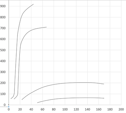
Hi. I have an excel graph with paths that I want to emulate in plotly. See below:
My approach is to convert the graph into an SVG either by copying it into illustrator or using an excel to svg converter. I then find the appropriate path for the add_shape parameter.
For the line on the far left, the SVG conversion breaks it into two paths:
M125.06,138.7c-18.43,11.59-36.09,23.86-47.61,35.45-11.52,11.59-15.36,17.04-22.27,35.45-6.91,18.41-14.59,53.18-18.43,76.36-3.84,23.18-2.3,8.18-6.14,64.08-3.84,55.9-9.98,162.94-15.36,269.98
and
M15.26,620.02c-1.54,6.79-3.08,13.58-6.17,18.34s-8.48,8.15-13.87,11.54
This does not seem to produce any shape at all. Is there a way to easily convert these lines to path for plotly? I can upload the excel graph in question, but I’m not sure if that’s allowed.
Thanks for any help that can be given
Here is my code.
data = {
    "Oxygen Index": [10, 20, 30, 40, 50, 60, 70, 80, 90, 100, 150, 180],
    "Hydrogen Index": [100, 200, 300, 400, 500, 600, 700, 800, 900, 1000, 200, 300],
}

df = pd.DataFrame(data)

fig = px.scatter(
    df,
    x="Oxygen Index",
    y="Hydrogen Index",
)

fig.update_layout(
    xaxis=dict(range=[0, 200]),
    yaxis=dict(range=[0, 1000])
)

fig.add_shape(
    type="path",
    path="M 15.26 620.02 C -1.54, 6.79-3.08, 13.58-6.17, 18.34 S -8.48, 8.15 -13.87, 11.54",
    line=dict(color="gray", width=2, dash="dot")
)

fig.add_shape(
    type="path",
    path="M125.06,138.7c-18.43,11.59-36.09,23.86-47.61,35.45-11.52,11.59-15.36,17.04-22.27,35.45-6.91,18.41-14.59,53.18-18.43,76.36-3.84,23.18-2.3,8.18-6.14,64.08-3.84,55.9-9.98,162.94-15.36,269.98",
    line=dict(color="gray", width=2, dash="dot")
)

fig.show()
