Hello everyone,
I’m working on a personal project for educational purposes. Everything related to Plotly works just fine in my JupyterLab notebook. My project involves converting my notebook to an .html file via nbconverter.
Now, when I convert the file, my Plotly charts are still visible, however the axis labels are all out of order. I believe this might have something to do with the data types of the columns/indexes of the dataframes being used, but I’ve tried changing them numerous times and nothing seems to be working.
For example:
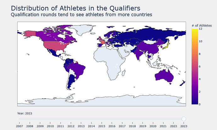
This is what it looks like when I run it in JupyterLab. This is correct:
However, after converting it, it gets displayed like this:
This code for the slider looks like this:
# Slider creation
    steps = []
    for i in range(0, len(data_bal)):
        step = dict(method="restyle",
                    args=["visible", [False] * len(data_bal)],
                    label=str(YEARS[i])) #i've tried with and without the str(), but the result is the same
        step['args'][1][i] = True
        steps.append(step)
It also happens with my heatmap. This is what it looks like in JupyterLab:
And this is how it gets displayed:
# Create plotly figure with heatmap
fig = go.Figure(data=go.Heatmap(
                    x=dat.columns, # dtype='int32'
                    y=dat.index,   # dtype='object'
                    z=dat,
                    name='',
                    hoverongaps=False,
                    hovertemplate="<b>%{y}</b><br>Year: %{x}<br>Finals: %{z}"))
In my Makefile, my nbconvert command looks like this:
# convert ipynb to html
convert:
	jupyter nbconvert --execute \
	--ExecutePreprocessor.timeout=600 \
	--TemplateExporter.exclude_input=True \
	--TemplateExporter.exclude_output_prompt=True \
	--to html "IFSC Analysis.ipynb" \
	--output docs/index.html
Can anyone provide any context as to why this might be happening? I’m relatively new to Plotly (< 2 weeks). I’m trying to have my notebook display on a GitHub Page, which is why I’m trying to convert it to HTML. If anyone can offer me any advice, or point me in the right direction, I’d be extremely grateful.


