Hello,
I am looking for any quick tips that lock in the color values for the color bar on my scatter plot. The dynamic options are great with plotly, however, I can’t seem to find a property in the documentation that freezes the color of the value corresponding to my color bar after zooming into my scatter plot. Here are my key word arguments to my function.
colors=[
# Let first 20% (0.2) of the values have color rgb(0, 0, 0)
[0, “rgb(255, 255, 255)”],
[0.2, “rgb(255, 255, 255)”],
    # Let values between 20-40% of the min and max of z
    [0.2, "rgb(192, 192, 192)"],
    [0.4, "rgb(192, 192, 192)"],

    [0.4, "rgb(128, 128, 128)"],
    [0.6, "rgb(128, 128, 128)"],

    [0.6, "rgb(64, 64, 64)"],
    [0.8, "rgb(64, 64, 64)"],

    [0.8, "rgb(0, 0, 0)"],
    [1.0, "rgb(0, 0, 0)"],
]
colorbardict = dict(tick0=0, dtick=20, nticks = 5)
marker35 = {‘showscale’: True , ‘color’: df[‘COLOR_PROPEFF’].dropna(axis=0).tolist(), ‘cmin’: 0, ‘cmax’: 100, ‘colorbar’:colorbardict, ‘colorscale’: colors, ‘size’: 12, ‘symbol’: ‘circle’, ‘cauto’:False, ‘autocolorscale’: False}
following my function argument
if graphId == ‘graph35’:
fig.add_trace(go.Scattergl(x=agg_dict[col][‘x’], y=agg_dict[col][‘y’], name=col + “_” + agg_dict[col][‘label’],
                                                mode='markers',
                                                marker=marker35))
Pictures of what I am referencing to:

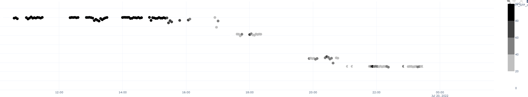
After zooming into the data, the datapoints reshade their color based on the total data points of those value shown on the chart from the color scale .
Thank you all for the help. I love plotly.