Checklist not displaying graph

Hi,
I have an app that displays graphs, I added checkbox so that the user can select what to display, here is the code:

app.layout = html.Div(children=[
html.H1(children=‘Network Traffic Monitor’, style={‘text-align’: ‘center’}),
html.Div([
html.Label([‘Select a Graph to Display:’],style={‘font-weight’: ‘bold’}),
dcc.Checklist(
id=‘list’,
options=[
{‘label’: ‘Top 10 inboud traffic IP addresses’, ‘value’: ‘fig1’},
# {‘label’: ‘Top 10 outboud traffic IP addresses’, ‘value’: ‘fig2’},
# {‘label’: ‘Top Active Ports’, ‘value’: ‘fig3’},
# {‘label’: ‘Top Active IP-Ports’, ‘value’: ‘fig4’},
],
value=[‘fig1’],
style={“width”: “50%”},
inline=True
),
html.Div(dcc.Graph(id=‘graph’)),
]),
])

@app.callback(
Output(‘graph’, ‘figure’),
[Input(component_id=‘list’, component_property=‘value’)])

However, it is showing a blank graph like the below:

A similar code I am using for a dropdown and works fine (thanks to @hoatran ), in general I thought all I need is to change the feature from dropdown to checkbox, but apparently is it not

Any help is highly appreciated

How did you code your callback? Can you show us?

Do you mean this part?

@app.callback(
Output(‘graph’, ‘figure’),
[Input(component_id=‘list’, component_property=‘value’)])
def select_graph(value):
if value == ‘fig1’:
fig1 = go.Figure(data = px.bar(df[‘Source’],
x=inbound_ip_count.index, y= inbound_ip_count.values,
labels={
‘x’: ‘IP Addresses’,
‘y’: ‘Packets’,
},
title=‘Top 10 inbound traffic IP addresses’)
)
return fig1

But again, my question is that is there a difference between the checklist and dropbox?

In this case if you want to show each figure based on selected value, I think you should use Radioitems instead of Checklist. And basically Radioitems and Dropdown is same.

Thanks but actually I want the checkbox, as user might select more than one to display

Hi @arafeek
checkbox allows the user to select more than one option, then the value returned to the callback is a list, not a single value, you can’t ask

if value == ‘fig1’:

and expect a true answer. :woozy_face:
In a dropdown works because the input is a single value.
That’s why @hoatran suggest a checklist.

1 Like

Can you post your sample data and code of yours? If not I think you could think about using subplots. Something as below:

import dash
from dash import dcc
from dash import html
import dash_bootstrap_components as dbc
from dash.dependencies import Input, Output
import pandas as pd
import plotly.express as px
from dash.exceptions import PreventUpdate

df = px.data.gapminder().query("continent=='Oceania'")
df = df[df['country'] == 'Australia']
df2 = df.melt(id_vars=['country','year'], value_vars=['lifeExp','gdpPercap','pop'])

app = dash.Dash(__name__, title='Dashboard', external_stylesheets=[dbc.themes.BOOTSTRAP])

app.layout = html.Div([
    html.Div(id='graph'),
    dcc.Checklist(id='checklist', 
                  options=['lifeExp','gdpPercap','pop'],
                  value=['lifeExp'])
])

@app.callback(Output('graph','children'), 
              Input('checklist','value'))

def update_graph(checklist):
    if len(checklist) == 1:
        dff = df2[df2['variable'].isin(checklist)]
        fig = px.line(dff,x='year',y='value',color='variable')     
        return dcc.Graph(figure=fig)
    elif len(checklist) >= 2:
        dff = df2[df2['variable'].isin(checklist)]
        fig = px.line(dff,x='year',y='value',facet_col="variable")
        return dcc.Graph(figure=fig)
    else:
        raise PreventUpdate

if __name__ == "__main__":
    app.run_server(debug=False)


1 Like

Hi @hoatran , thanks again, in fact there is a change of plan, I will go with the dropdown as it takes less space, however I have another issue with it, but I am not sure if I should start a new topic or we can continue here, anyways, I will post the situation here, but please let me know if you want me to open a new case:
The following code suppose to calculate two graphs (data included), then based on the selection of the drop down, it shows whatever graph select, it works ok, until…
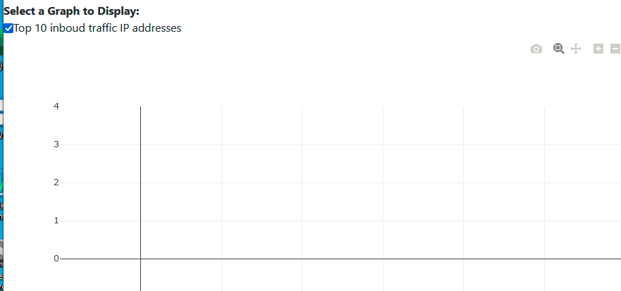
The issue is when I enable the multi select, the initial graph upon loading is ok, but once i select another graph, everything dissappears and even if I cancel all and return to the first graph only, it does not show anymore, any idea why?
Also, when I select more than one graph, can I show 2 per row? because (I think) what will happen is that it will show one per row.

here is the code, and thanks

import pandas as pd
import plotly.express as px
import plotly.graph_objects as go
import dash
import dash_bootstrap_components as dbc
from dash import Input, Output, dcc, html
import time, os, glob, sys
import multiprocessing as mp


app = dash.Dash(__name__, title='Network Monitoring Dashboard', external_stylesheets=[dbc.themes.BOOTSTRAP])
app.layout = html.Div([
    dcc.Interval(
            id='interval-component',
            interval=5*3000, # in milliseconds
            n_intervals=0
        ),
    dbc.Col([
        html.Div([
        html.Label(['Choose a graph:'],style={'font-weight': 'bold'}),
        dcc.Dropdown(
            id='dropdown',
            options=[
                {'label': 'Top 10 incoming traffic IP addresses', 'value': 'fig1'},
                {'label': 'Top 10 outgoing traffic IP addresses', 'value': 'fig2'},
                {'label': 'Top Active Ports', 'value': 'fig3'},
                {'label': 'Top Active IP-Ports', 'value': 'fig4'},
                    ],
            multi=True,
            value='fig1',
            style={"width": "60%"}, clearable=False),
        ]),
    html.Div(id='graph-container'),
])
])

@app.callback(Output('graph-container', 'children'),
              [Input('dropdown', 'value'),
              Input('interval-component','n_intervals')])
def update_graph(value, n):
    data = [['192.168.0.105','192.168.0.103','TCP'],
                ['192.168.0.103','192.168.0.105','TCP'],
                ['192.168.0.105','192.168.0.103','UDP'],
                ['52.98.151.66','192.168.0.105','TCP'],
                ['192.168.0.105','52.98.151.66','ICMP'],
                ['52.98.228.226','192.168.0.105','ICMP'],
                ['52.98.228.226','192.168.0.105','UDP'],
                ['192.168.0.103','224.0.0.251','1UDP'],
                ['192.168.0.105','52.98.228.226','TCP']]
    column_names = ['Source', 'Destination','Protocol']
    for i in range(6):
        df = pd.DataFrame (data)
        df.columns = column_names

    inbound_ip_count = df.groupby('Source').size().nlargest(n=10)
    outbound_ip_count = df.groupby('Destination').size().nlargest(n=10)
    port_count = df.groupby('Protocol').size().nlargest(n=10)
    sources_grp = df.groupby(['Source', 'Protocol'], as_index=False)['Destination']\
        .count().sort_values('Destination', ascending=False)
    
    # Get the top 5 occurrences of Source
    top_sources = df['Source'].value_counts()[:5].index.tolist()
    
    # Filter the dataframe to only include the top 5 occurrences of Source
    top_sources_df = sources_grp[sources_grp['Source'].isin(top_sources)]\
        .reset_index(drop=True)
    
    # Rename the count column to 'Protocol Count'
    top_sources_df = top_sources_df.rename(columns={'Destination': 'Protocol Count'})

    if value == 'fig1':
        fig1 = go.Figure(data = px.bar(df['Source'],
                        x=inbound_ip_count.index, y= inbound_ip_count.values,
                        labels={
                          'x': 'IP Addresses',
                          'y': 'Packets',
                      },
                            title='Top 10 incoming traffic IP addresses')
                      )
        return dcc.Graph(id='live-graph2', figure = fig1)
    # Ploting top 10 Outbound traffic IP addresses
    elif value == 'fig2':
        fig2 = go.Figure(data = px.bar(df['Destination'],
                        x=outbound_ip_count.index, y=outbound_ip_count.values,
                        labels={
                          'x': 'IP Addresses',
                          'y': 'Packets',
                      },
                        title='Top 10 Outbound traffic IP addresses')
                     )
        return dcc.Graph(id='live-graph2', figure = fig2)

def server_run():
    app.run_server(debug=False, use_reloader=False)
if __name__ == "__main__":
    if not os.path.exists(r'c:/DataCapture'):
        os.mkdir(r'c:\DataCapture')
#    p1 = mp.Process(target=capturing_loop)
    p2 = mp.Process(target=server_run)
#    p1.start()
    p2.start()

I think you should add one more condition when you choose both of them. Something as below:

import pandas as pd
import plotly.express as px
import plotly.graph_objects as go
import dash
import dash_bootstrap_components as dbc
from dash import Input, Output, dcc, html
import time, os, glob, sys
import multiprocessing as mp
from dash.exceptions import PreventUpdate

app = dash.Dash(__name__, title='Network Monitoring Dashboard', external_stylesheets=[dbc.themes.BOOTSTRAP])
app.layout = html.Div([
    dcc.Interval(
            id='interval-component',
            interval=5*3000, # in milliseconds
            n_intervals=0
        ),
    dbc.Col([
        html.Div([
        html.Label(['Choose a graph:'],style={'font-weight': 'bold'}),
        dcc.Dropdown(
            id='dropdown',
            options=[
                {'label': 'Top 10 incoming traffic IP addresses', 'value': 'fig1'},
                {'label': 'Top 10 outgoing traffic IP addresses', 'value': 'fig2'},
                {'label': 'Top Active Ports', 'value': 'fig3'},
                {'label': 'Top Active IP-Ports', 'value': 'fig4'},
                    ],
            multi=True,
            value=['fig1'],
            style={"width": "60%"}, clearable=False),
        ]),
    html.Div(id='graph-container'),
])
])

@app.callback(Output('graph-container', 'children'),
              [Input('dropdown', 'value'),
              Input('interval-component','n_intervals')])
def update_graph(value, n):
    data = [['192.168.0.105','192.168.0.103','TCP'],
                ['192.168.0.103','192.168.0.105','TCP'],
                ['192.168.0.105','192.168.0.103','UDP'],
                ['52.98.151.66','192.168.0.105','TCP'],
                ['192.168.0.105','52.98.151.66','ICMP'],
                ['52.98.228.226','192.168.0.105','ICMP'],
                ['52.98.228.226','192.168.0.105','UDP'],
                ['192.168.0.103','224.0.0.251','1UDP'],
                ['192.168.0.105','52.98.228.226','TCP']]
    column_names = ['Source', 'Destination','Protocol']
    for i in range(6):
        df = pd.DataFrame (data)
        df.columns = column_names

    inbound_ip_count = df.groupby('Source').size().nlargest(n=10)
    outbound_ip_count = df.groupby('Destination').size().nlargest(n=10)
    port_count = df.groupby('Protocol').size().nlargest(n=10)
    sources_grp = df.groupby(['Source', 'Protocol'], as_index=False)['Destination']\
        .count().sort_values('Destination', ascending=False)
    
    # Get the top 5 occurrences of Source
    top_sources = df['Source'].value_counts()[:5].index.tolist()
    
    # Filter the dataframe to only include the top 5 occurrences of Source
    top_sources_df = sources_grp[sources_grp['Source'].isin(top_sources)]\
        .reset_index(drop=True)
    
    # Rename the count column to 'Protocol Count'
    top_sources_df = top_sources_df.rename(columns={'Destination': 'Protocol Count'})

    if value == ['fig1']:
        fig1 = go.Figure(data = px.bar(df['Source'],
                        x=inbound_ip_count.index, y= inbound_ip_count.values,
                        labels={
                          'x': 'IP Addresses',
                          'y': 'Packets',
                      },
                            title='Top 10 incoming traffic IP addresses')
                      )
        return dcc.Graph(id='live-graph2', figure = fig1)
    # Ploting top 10 Outbound traffic IP addresses
    elif value == ['fig2']:
        fig2 = go.Figure(data = px.bar(df['Destination'],
                        x=outbound_ip_count.index, y=outbound_ip_count.values,
                        labels={
                          'x': 'IP Addresses',
                          'y': 'Packets',
                      },
                        title='Top 10 Outbound traffic IP addresses')
                     )
        return dcc.Graph(id='live-graph2', figure = fig2)
    
    elif value == ['fig1','fig2']:
        df2 = df.melt(id_vars=['Protocol'], value_vars=['Source','Destination'])
        df3= df2.groupby(['variable','value'])['value'].count().reset_index(name='counts')
        fig3 = px.bar(df3,x='value', y='counts',facet_col='variable')
                     
        return dcc.Graph(id='live-graph2', figure = fig3)
    else:
        raise PreventUpdate

if __name__ == '__main__':
    app.run_server(debug=False)

Thanks,

Interesting,

However, a point and an issue:
The point is that if I have more than 2 graphs, in fact I have 4, then I have to make all possible combinations in separate if statements, correct? which are:

(1+2), (1+3), (1+4), (2+3), (2+4), (3+4)

The issue here is that if I select fig1, then fig2, they both show as expected, but if I remove fig1 (leaving only fig2), then I re select fig1, fig1 will not show until I remove fig2 and add it again, so selection should be in sequence.

Any idea how to manage this please?

Thanks, as always, great support

1 Like

BTW, in the above elif, why did you use

fig3

?

Yep, I think so, we have to define it with if else.
With this problem I think you can add or in your if condition:

elif value == ['fig1','fig2'] or value == ['fig2','fig1']:

For the fig3, it’s just the name. You can name it whatever you want.

Thanks,

But for fig3, I thought it should represent something that it displays, correct?

So as I said, it’s just the name. You can set it as fig, fig1, fig2 or fig_1_2, something like this. In this case fig3 is representing graphs with 2 options.

    elif value == ['fig1','fig2'] or value == ['fig2','fig1']:
        df2 = df.melt(id_vars=['Protocol'], value_vars=['Source','Destination'])
        df3= df2.groupby(['variable','value'])['value'].count().reset_index(name='counts')
        fig3 = px.bar(df3,x='value', y='counts',facet_col='variable')
                     
        return dcc.Graph(id='live-graph2', figure = fig3)

mmm, something to digest first, but thanks again

1 Like

Yep, please tell me if you have any questions or don’t understand.

Ok, this works, however my concern is that I have to redo the calculation for each graph in each if statement, so I moved the graphs (fig1, fig2) outside the if statement, then added those lines:

elif value == [‘fig1’,‘fig2’] or value == [‘fig2’,‘fig1’]:
return dcc.Graph(id=‘live-graph2’, figure = fig1), dcc.Graph(id=‘live-graph2’, figure = fig2)

The result is ok, displaying the graphs as expected, but in separate rows, any suggestion on how to put both in the same row?

1 Like

Hello @arafeek,

To put them in the same row, you can wrap them in a html.Div([fig1, fig2], style={'display':'flex'}) where fig1 and fig2 are your dcc.Graphs. :slight_smile:

1 Like

And this should be in the layout section, correct?

return html.Div([dcc.Graph(id=‘live-graph2’, figure = fig1), dcc.Graph(id=‘live-graph2’, figure = fig2)],
style={'display':'flex'})

Assuming you are returning to single div, this should do the trick.

Or you could style the div with the display flex. Its up to you.

1 Like