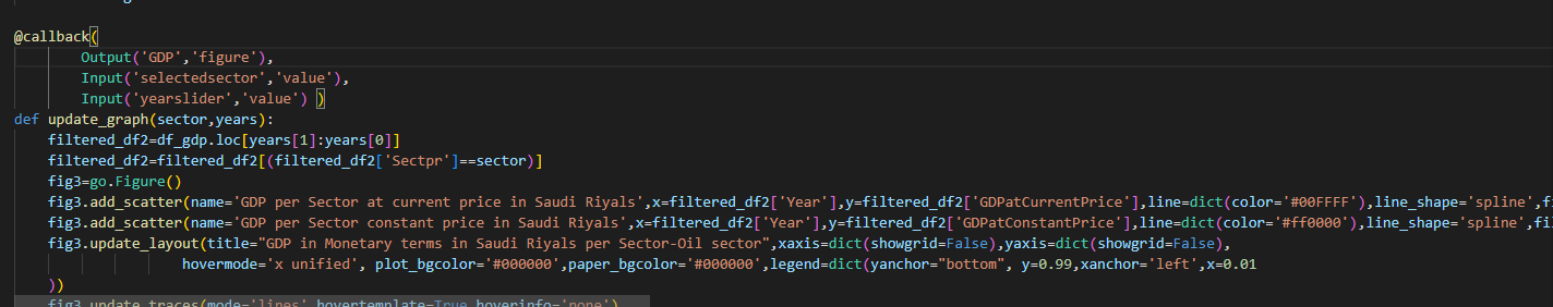
Hm I see some problem with your code as below:
- First: Your code is quite long for one row of code and it’s quite hard to check.
- Second: Some mistake in column name (Ex: GDPatConstantPrice, GDPatCurrentPrice)
- Third: I think you don’t need to set index as Year but you can use this Year columns to return filtered df.
Please check below code:
import pandas as pd
import numpy as np
import dash
from dash import html
from dash import dcc
import plotly.graph_objects as go
from dash.dependencies import Input ,Output
import dash_bootstrap_components as dbc
import plotly_express as px
from plotly.subplots import make_subplots
from dash import dcc, html, callback, Output
df_unemplo=pd.read_excel("data/unemployment data KSA.xlsx")
df_econ=pd.read_excel("data/SaudI_economics_data.xlsx")
df_growth=pd.read_excel("data/GDP per Capital.xlsx")
df_gdp=pd.read_excel("data/GDP at current price vs Constant price.xlsx")
df_contrib=pd.read_excel("data/contribution by sector_saudi Economy.xlsx")
# Clean and Wrangle the Data to plot the charts-----------------------------------------------------------------------------------------
df_unemplo.dropna(inplace=True)
df_unemplo.columns=df_unemplo.columns.str.replace(" ","")
df_unemplo['date']=pd.to_datetime(df_unemplo['date'], format='%Y') # convert to date time -------------------------------------------
df_growth['Year']=pd.to_datetime(df_growth['Year'],format='%Y')
df_growth['Year']=df_growth['Year'].dt.year
#df_gdp=df_gdp.set_index('Year')
#df_econ=df_econ.set_index('Year')
df_grouped=df_contrib.groupby(['sector'])['% Contribution to GDP'].mean().sort_values(ascending=False)
# plot the charts that do require call back ---------------------------------------------------------------------------------------------
df_unemplo.dropna(inplace=True)
df_unemplo.columns=df_unemplo.columns.str.replace(" ","")
df_unemplo['date']=pd.to_datetime(df_unemplo['date'], format='%Y')
df_unemplo["Color"] = np.where(df_unemplo["AnnualChange"]<0, 'green', 'red')
fig4=make_subplots(rows=2,cols=1,shared_xaxes=True,shared_yaxes=False ,vertical_spacing=0.02,
y_title='Changes Unemployment Rate',
row_heights=[0.7,0.2] )
fig4.layout.template="plotly_dark"
fig4.add_trace(go.Scatter(x=df_unemplo['date'],
y=df_unemplo['UnemploymentRate(%)'],
line=dict(color='#00FFFF'),
line_shape='spline',
fill='tonexty' ,
fillcolor='rgba(0,255,255,0.1)',
name="unemployment Rate"),
row=1,
col=1,
secondary_y=False)
fig4.update_xaxes(rangeslider_visible=False,
rangeselector= dict(buttons=list([dict(count=5,label='5y',step="year",stepmode="backward"),
dict(count=10,label='10y',step="year",stepmode="backward"),
dict(count=15,label='15y',step="year",stepmode="backward"),
dict(count=20,label='20y',step="year",stepmode="backward"),
dict(count=25,label='25y',step="year",stepmode="backward"),
dict(label="All",step="all")
])))
fig4.add_trace(go.Bar( x=df_unemplo['date'],
y=df_unemplo['AnnualChange'],
marker_color=df_unemplo['Color'],
name='change%'),
row=2,
col=1,
secondary_y=False)
fig4.update_layout(title="Unemployment Rate Since 1992",
xaxis=dict(showgrid=False),
yaxis=dict(showgrid=False),
hovermode='x unified',
plot_bgcolor='#000000',
paper_bgcolor='#000000' ,
showlegend=False)
fig4.update_traces(xaxis='x2' )
# plot the pie chart -------------------------------------------------------------------------------------------------------------------------------
labels = df_contrib['sector'].unique()
values = df_grouped
# Use `hole` to create a donut-like pie chart
fig5 = go.Figure(data=[go.Pie(labels=labels, values=values, hole=.55)])
fig5.update_layout(title=' Average Contribution Of Saudi Economic Sectors To GDP Since 2010',
annotations=[dict(text='% Contribution by Sector', x=0.5, y=0.5, font_size=15, showarrow=False)])
fig5.layout.template="plotly_dark"
# Set the page layout -----------------------------------------------------------------------------------------------------------------------------------
app = dash.Dash(__name__, use_pages=False, external_stylesheets=[dbc.themes.CYBORG],meta_tags=[{'name': 'viewport',
'content': 'width=device-width, initial-scale=1.0'}])
app.layout =dbc.Container([
dbc.Row([
dbc.Col([
html.H2("Economic Performance ",className='text-center mb-4')],width=12)
]),
dbc.Row([
html.Marquee("Gain Insights About Saudi Economic Performance-Population Growth Trends --Health Care Indicators and More From Bahageel Dashboard--Figures are Compiled From Saudi General Authority For Statistics", style = {'color':'cyan'}),
]),
dbc.Row([
dbc.Col([
dbc.Card([
dbc.CardImg(src="https://lh3.googleusercontent.com/-KeCfuHtNnEw/Vjz8LkunXjI/AAAAAAAAphU/NXKVxYPg4-w/s0/saudi-arabia-flag-animation.gif",top=True,bottom=False),
dbc.CardBody([
html.H4('Saudi Dashboard',className='card-title'),html.P('Choose economic sector:',className='card-text'),
dcc.Dropdown(id='selectedsector',
multi=False,
value='Oil Sector',
options=[{'label':x,'value':x} for x in sorted(df_gdp['Sectpr'].unique())],
clearable=False,
style={"color": "#000000"})])],
color="dark",inverse=True,outline=False)],width=2,xs=4) ,
]),
dbc.Row([
dbc.Col([
html.H6(['Choose Years to view GDP in the Sector :'],
style={'font-weight': 'bold'}),
html.P(),
dcc.RangeSlider(id='yearslider',
marks={2010:'2010',
2011:'2011',
2012: '2012',
2013:'2013',
2014:'2014',
2015:'2015',
2016:'2016',
2017:'2017',
2018:'2018',
2019:'2019',
2020:'2020',
2021:{'label': '2021',
'style': {'color':'#00FFFF',
'font-weight':'bold'}}},
step=1,
min=2010,
max=2021,
value=[2010,2015],
dots=True,
allowCross=False,
disabled=False,
pushable=2,
updatemode='drag',
included=True,
vertical=False,
verticalHeight=900,
className='None',
tooltip={'always_visible':False, 'placement':'bottom'})]),
dbc.Col([
dcc.Graph(id='growthrate',figure={})
],xs=12, sm=12, md=12, lg=5, xl=5),
dbc.Col([
dcc.Graph(id='GDP',figure={})
],xs=12, sm=12, md=12, lg=5, xl=5),
html.Br(),
dbc.Row([
dbc.Col([
dcc.Graph(id='stat1',figure=fig4)],xs=12, sm=12, md=12, lg=5, xl=5),dbc.Col([dcc.Graph(id='stat2',figure=fig5)],xs=12, sm=12, md=12, lg=5, xl=5)])
])
])
@callback(
Output('growthrate','figure'),
Input('selectedsector','value'),
Input('yearslider','value') )
def update_graph(sector,years):
years_0, years_1 = years
filtered_df=df_econ[(df_econ['Year'] >= years_0)&(df_econ['Year'] <= years_1)]
filtered_df=filtered_df[filtered_df['sector']==sector]
fig2=go.Figure()
fig2.add_scatter(name='GDP per Sector at current price -growth rate',
x=filtered_df['Year'],
y=filtered_df['GDP(Current price)'],
line=dict(color='#00FFFF'),
line_shape='spline',
fill='tonexty' ,
fillcolor='rgba(0,255,255,0.1)')
fig2.add_scatter(name='GDP per Sector constant price -growth rate',
x=filtered_df['Year'],
y=filtered_df['GDP(constant price)'],
line=dict(color='#ff0000'),
line_shape='spline',
fill='tonexty' ,
fillcolor='rgba(255,255,102,0.1)')
fig2.update_layout(title="GDP rate per Sector Of Saudi Economy",
xaxis=dict(showgrid=False),
yaxis=dict(showgrid=False),
hovermode='x unified',
plot_bgcolor='#000000',
paper_bgcolor='#000000',
legend=dict(yanchor="bottom", y=0.99,xanchor='left',x=0.01
))
fig2.update_traces(mode='lines',hovertemplate=True,hoverinfo='none')
fig2.layout.template="plotly_dark"
return fig2
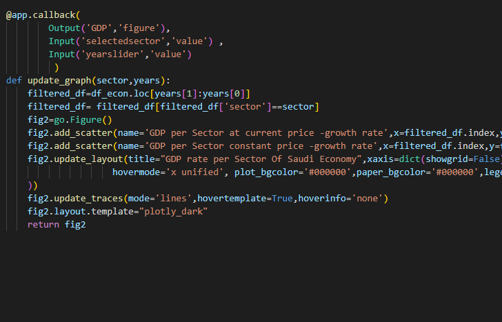
@callback(
Output('GDP','figure'),
Input('selectedsector','value'),
Input('yearslider','value') )
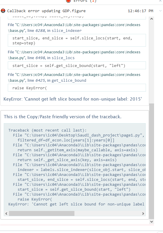
def update_graph(sector,years):
years_0, years_1 = years
filtered_df2=df_gdp[(df_gdp['Year'] >= years_0)&(df_gdp['Year'] <= years_1)]
filtered_df2=filtered_df2[(filtered_df2['Sectpr']==sector)]
fig3=go.Figure()
fig3.add_scatter(name='GDP per Sector at current price in Saudi Riyals',
x=filtered_df2['Year'],
y=filtered_df2['GDP at Current Price '],
line=dict(color='#00FFFF'),
line_shape='spline',
fill='tonexty' ,
fillcolor='rgba(0,255,255,0.1)')
fig3.add_scatter(name='GDP per Sector constant price in Saudi Riyals',
x=filtered_df2['Year'],
y=filtered_df2['GDP at Constant Price'],
line=dict(color='#ff0000'),
line_shape='spline',fill='tonexty' ,
fillcolor='rgba(255,255,102,0.1)')
fig3.update_layout(title="GDP in Monetary terms in Saudi Riyals per Sector-Oil sector",
xaxis=dict(showgrid=False),
yaxis=dict(showgrid=False),
hovermode='x unified',
plot_bgcolor='#000000',
paper_bgcolor='#000000',
legend=dict(yanchor="bottom", y=0.99,xanchor='left',x=0.01
))
fig3.update_traces(mode='lines',hovertemplate=True,hoverinfo='none')
fig3.layout.template="plotly_dark"
return fig3
if __name__ == "__main__":
app.run(debug=False, port=8100)