the question is is there an interface into plotly.js box plots where I can manually specify the median, quartilles, outlier points etc. instead of handing the raw data to plotly.js and letting it do the computation?
The problem I have is with rendering performance. I use this for showing the results of micro benchmarking so it is not uncommon for me to have a data set with 5 traces ranging 80k to 500k samples each. Trying to render this boxplot in Firefox I get the famous “unresponsive script” (Chrome works mostly fine). This is on a recent i7 with an up to date Firefox.
I already compute the median and other statistics in the main language (Elixir) so it’d be easy for me to compute the other statistics as well and just pass them in so plotly.js wouldn’t have to deal with that overload of data and recompute data I already computed.
Any help would be truly appreciated so I can make a nice and performant HTML formatter for the results
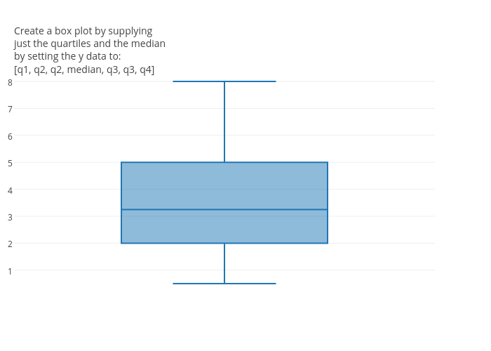
Alternatively, I’m pretty sure that you can create the box plot that you are looking for by just supplying your y data as [q1, q2, q2, median, q3, q3, q4]. Here is an example: https://plot.ly/~chris/18051/.
@chriddyp I came across this post as I was describing for another user how to do this - just to standardize terminology, I think you mean: [min, q1, q1, median, q3, q3, max]
There are an infinite variety of ways to do this, but the one I’ve used is: [min, q1, median, median, q3, max]
This is actually used internally by plotly.js to construct candlestick charts out of boxes, using q1=open and q3=median=close - mine has one less duplicated value, though it occurs to me that your version is probably robust in other box plot software that makes a different choice of how to calculate quartiles - as discussed in Boxplot quartile seem’s wrong