Hi,
I was wondering if Plotly can start support for nested X /multiple X axis?
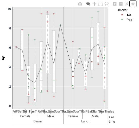
For instance if one is using standard “tip” data, adding a capability as implemented in (fivecents plot, JMP or Origin ) would be beneficial.
i.e.
import plotly.express as px
df = px.data.tips()
%load_ext autoreload
%autoreload 2
%matplotlib inline
import fivecentplots as fcp
import pandas as pd
import numpy as np
import os, sys, pdb
osjoin = os.path.join
db = pdb.set_trace
fcp.boxplot(df=df, y=‘tip’, groups=[‘time’, ‘sex’, ‘day’], legend=‘smoker’)
would generate:
If this capability already exist - please add a comment.
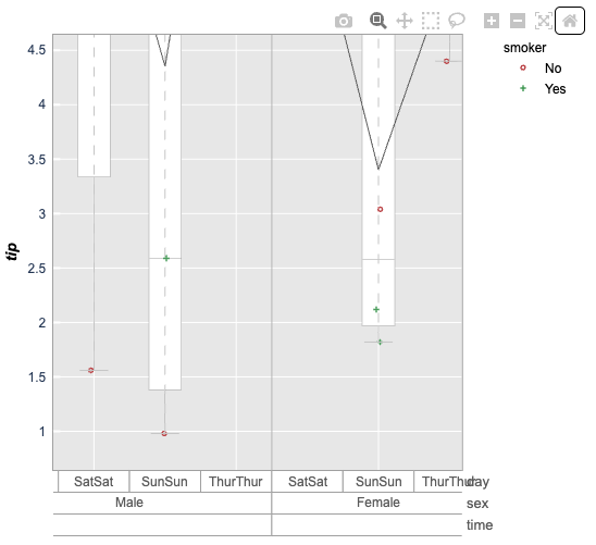
I too am looking for this specific functionality. many engineering companies need to see data with multiple levels of grouping (temperature, power, frequency, etc, etc)… all in one plot… jmp works okay but it prevents automated reports. we would like to switch to plotly but this functionality is keeping us from converting. we have tried passing in multiple xaxis values but we only get 2 levels deep. we need to know if more levels can be added. the only plot repo is five cent plots (original posters image). Here is another example plot of what is needed, if anyone knows how this can be done.
it does work fine with mpl engine. but when I use plotly engine all the multi-variable x labels start overlapping with each other. I could not find a way to fix that.
Currently the plotly engine does not have all the bells and whistles of mpl, like auto-rotating your labels when they are too long for the plot dimensions. I’ll add that eventually, but the quick solution is to just make your ax_size larger.