Hi,
I’m new here and this is my first post. I want to create a barplot in matlab (not sure if this is the right place for this question). I used following lines-
bar_data=[62.91 60.39
46.96 42.19
29.63 26.45
22.68 19.83
31.64 28];
figure;
grid on;
J1=bar(bar_data,‘BarWidth’, 1);
l = cell(1,5);
l{1}=‘a’; l{2}=‘b’; l{3}=‘c’; l{4}=‘d’; l{5}=‘avg’;
set(gca,‘xticklabel’, l) ;
w = {‘blue’, ‘red’};
legend(w);
everything looks nice. as shown in attached figure.
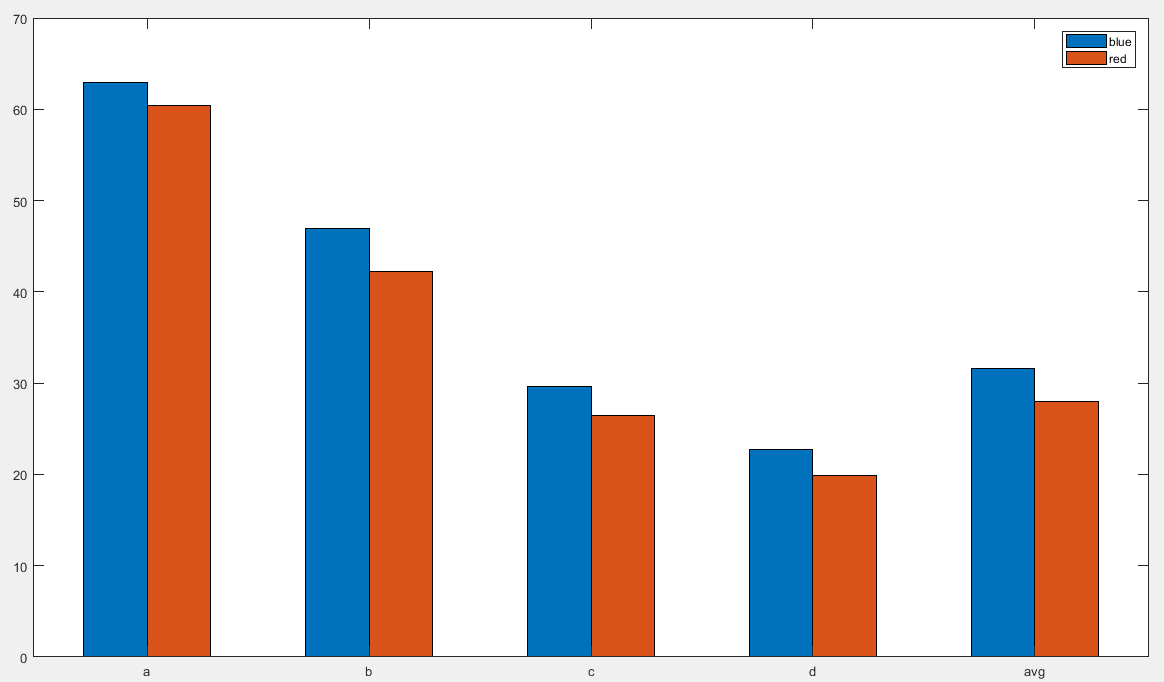
But I want to create a new y- axis only for avg in the right side with a scale from 25 to 35. I want to do it to show the reduction of red compare to blue.
Can anyone help me how to do that? Thanks in advance.