The plot is time-based (type date)
So like from 2019-01-01 to 2025-01-01
and the bar char should display 2 bars from 2020-01-01 to 2020-06-01
and another 2021-06-01 2022-12-31
Do you have any basic example I can start work from?
I tried several combinations with xperiod, xperiod0, base etc…
In trace1, the “x: [‘2021-01-01’]” is completely ignored and the bar runs at the end of the chart…
    var trace1 = {
      base: '2021-01-01', // start date
      x: ['2022-01-01'], // end date
      y: ['MED'],

        type: 'bar',
        orientation: 'h',
        name: 'Bar 1',
        marker: {
            color: 'rgba(55,128,191,0.6)'
        }
    };
After several hours of searching and trying and failing, I was lucky enough to find a post
I could get some ideas and finally, I got the solution I needed:
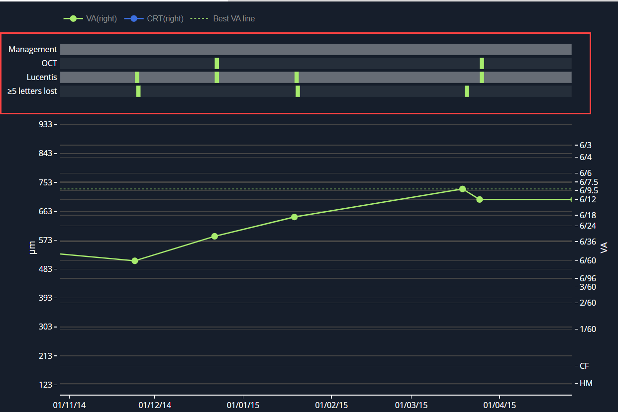
const managementData = [
	{ date: "2020-01-01" },
	{ date: "2020-06-01" },
	{ date: "2020-12-01" },
];

const OCT = [
	{ date: "2020-01-01" },
	{ date: "2020-03-01" },
	{ date: "2020-06-01" },
	{ date: "2020-09-01" },
	{ date: "2020-12-01" },
];

function getTraceFor(traceName, data) {

        // It will tell which line the bar goes.
        // As we have multiple bars on the same line it will be ["Title", "Title", "Title"]
	const y = [];

        // Starting x position of the bar
	const base = [];

        // This will be the width of each bar. I use the same width for every bar
        // So 1000000000 milliseconds works here
	const x = [];

	data.forEach(dataObject => {
		y.push(traceName);
		base.push(dataObject.date);
		x.push(1000000000);
	});

	return {
	  type: 'bar',
	  y: y,
	  base: base,
	  orientation: 'h',
	  x: x,
	  width: 0.3, // height of the bar
	  name: traceName,
	};
}

var data = [
  getTraceFor("OCT", OCT),
  getTraceFor("Management", managementData)
];

var layout = {
  xaxis: {
    type: 'date',
   //  range: ["2019-01-01", "2025-01-01"]
  },
  title: 'Chunk bar',
  barmode: 'stack'
};

Plotly.newPlot('myDiv', data, layout);