I noticed that plotting different time scales causes the opacity of my overlaid bar chart to fade. How do I correct this? In the first image, I plotted over a range of 2 years and in the second I plotted a 1 year time range. Notice that the former has a significantly faded bar chart, I would expect that these two charts to be the same regardless of range.
Sidenote: I am “hacking” the chart to center on the primary axis, if anyone can help me figure out how to directly set the y-axis range of the secondary axis that would be very helpful as well.
import plotly.graph_objects as go
from plotly.subplots import make_subplots
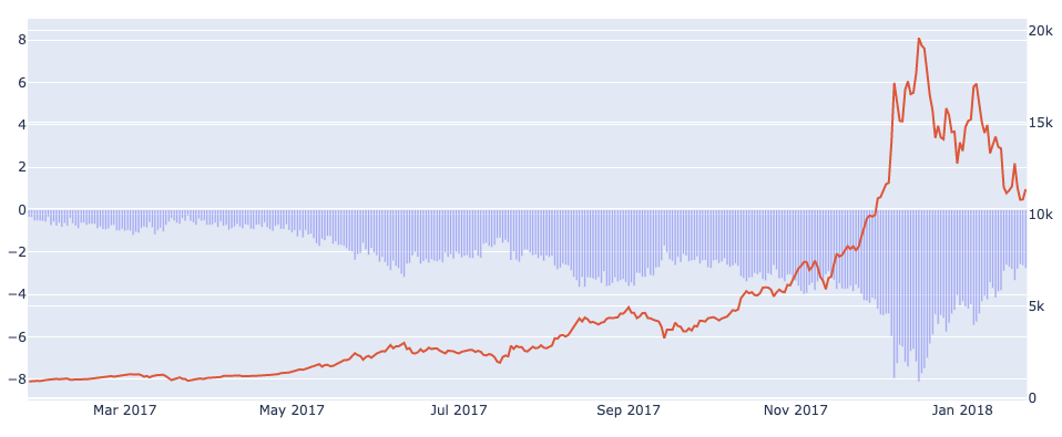
filtered = df[(df['date'] > '2017-1-24') & (df['date'] <= '2018-1-24')]
fig = make_subplots(specs=[[{"secondary_y": True}]])
fig.add_trace(
go.Bar(
x=filtered['date'],
y=filtered['divergence'],
opacity=0.5
)
)
fig.add_trace(
go.Scatter(
x=filtered['date'],
y=filtered['price'],
mode="lines"
),
secondary_y=True
)
fig.update_layout(yaxis_range=[-9, 9])
fig.show()