Hello,
I’m creating a number of charts that will have a variety of annotations added to them that represent the presence of a single condition.
What I would like to do is add a label in the chart legend to designate what these annotations represent.
Here’s a condensed example that can be recreated:
import pandas as pd
import numpy as np
import plotly.graph_objects as go

dates = pd.date_range(start='2020-01-01', periods=100)
random = np.random.RandomState(0)
df = pd.DataFrame({
  'data': data1
}, index=dates)

fig = go.Figure()
fig.add_trace(go.Scatter(x=df.index, y=df['data']))
arrow_dates = df[df.data > 0.8].index
arrow_values = df[df.data > 0.8]['data'].tolist()
annotation_arrows = [dict(x=arrow_date, y=arrow_val, showarrow=True, arrowwidth=2,
        arrowhead=1, arrowcolor='blue', yshift=10, arrowside='end') for arrow_date, arrow_val in zip(arrow_dates, arrow_values)]
fig.update_layout(annotations=annotation_arrows)
fig.show()
This provides the following chart:
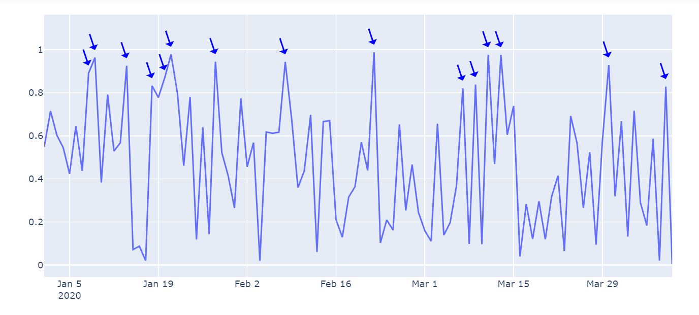
What I would like to do is have a legend for said chart that describes what the condition is. Ideally it would be an icon of the arrow itself with its description, something like ‘Data > 0.8’.
Is this possible?
Thank you.