Hi, I would like to add lines of 5 categories that are driving seasonal shifts in the dietary composition of my study species, using the plot_ly package in R.
I successfully made the 3D ordination but when I tried using the add_trace() function, the lines appeared with the appropriate category names, but the color palette for both the points as well as the lines, is incorrect. Any help would be greatly appreciated!
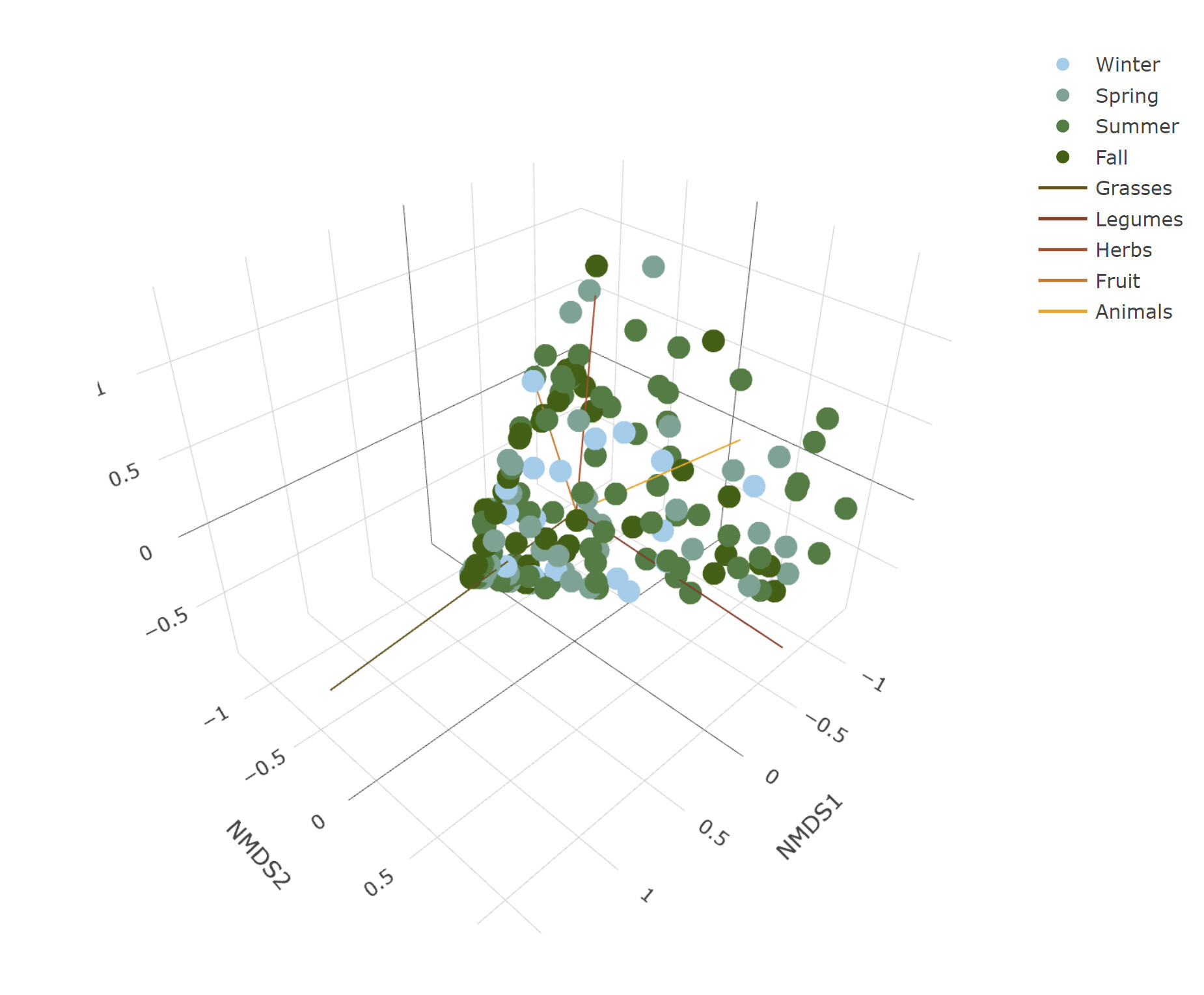
Add arrows to the plot to indicate which environmental variables are responsible for the shifts in the pattern
plot_arrow ← data.frame(NMDS1 = rep(0,10), NMDS2 = rep(0,10), NMDS3 = rep(0,10))
plot_arrow[6:10,] ← as.data.frame(scores(envfit.3D, “vectors”)) * exp(0.5)
plot_arrow$food.items ← c(“Grasses”, “Legumes”, “Herbs”, “Fruit”, “Animals”,“Grasses”, “Legumes”, “Herbs”, “Fruit”, “Animals”)pal ← c(“skyblue”, “darkgreen”, “brown”, “orange”)
scores.3D$season ← factor(scores.3D$season, levels = c(“Winter”, “Spring”, “Summer”, “Fall”))
plot.3d ← plot_ly(scores.3D, x=~NMDS1, y=~NMDS2, z=~NMDS3,
type=“scatter3d”, mode=“markers”,
color = as.factor(scores.3D$season),
colors = pal)
plot.3d

food.pal ← c(“forestgreen”, “blue”, “grey25”, “purple”, “red”)
plot_arrow$food.items ← factor(plot_arrow$food.items, levels = c(“Grasses”, “Legumes”, “Herbs”, “Fruit”, “Animals”))
plot.3d.arrows ← add_trace(plot.3d, x = ~plot_arrow$NMDS1, y = ~plot_arrow$NMDS2, z = ~plot_arrow$NMDS3,
type=“scatter3d”, mode=“lines”,
color = as.factor(plot_arrow$food.items),
colors = food.pal)
plot.3d.arrows
What confuses me is that when I plot the line segments on their own using the below code, the lines come out fine and with the appropriate color palette.
plot.3d.arrows2 ← plot_ly(scores.3D, x = ~plot_arrow$NMDS1, y = ~plot_arrow$NMDS2, z = ~plot_arrow$NMDS3,
type=“scatter3d”, mode=“lines”,
color = as.factor(plot_arrow$food.items),
colors = food.pal)
plot.3d.arrows2

Again, any help would be greatly appreciated!