CSS is a good way to do this. Here’s an example using the default style sheet (https://codepen.io/chriddyp/pen/bWLwgP):
import dash
import dash_html_components as html
import dash_core_components as dcc
app = dash.Dash()
app.layout = html.Div([
html.Div([
html.Div([
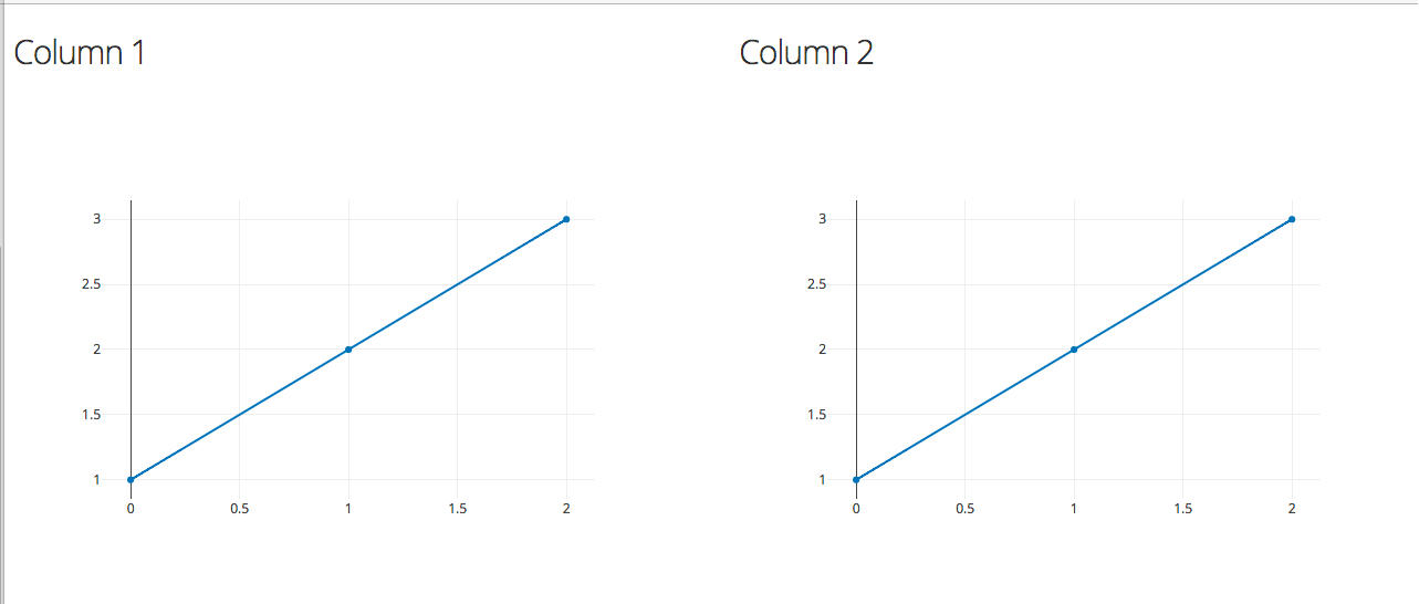
html.H3('Column 1'),
dcc.Graph(id='g1', figure={'data': [{'y': [1, 2, 3]}]})
], className="six columns"),
html.Div([
html.H3('Column 2'),
dcc.Graph(id='g2', figure={'data': [{'y': [1, 2, 3]}]})
], className="six columns"),
], className="row")
])
app.css.append_css({
'external_url': 'https://codepen.io/chriddyp/pen/bWLwgP.css'
})
if __name__ == '__main__':
app.run_server(debug=True)