# Create bar between start and end time on chart
**URL:** https://community.plotly.com/t/create-bar-between-start-and-end-time-on-chart/16750
**Category:** 📊 Plotly Python
**Created:** [December 11, 2018, 1:39am UTC](https://community.plotly.com/t/create-bar-between-start-and-end-time-on-chart/16750 "2018-12-11T01:39:01Z")
**Posts on this page:** 7
**Page:** 1
### Author:  [@pjford](https://community.plotly.com/u/pjford)
#### Post date: [December 11, 2018, 1:39am UTC](https://community.plotly.com/t/create-bar-between-start-and-end-time-on-chart/16750/1 "2018-12-11T01:39:01Z")
I have these results using jupyter notebook / pandas / plotly –

These refer to start and end times of a person working on days throughout the month of July.
Instead of two points on each end, what I’d really like are bars… ideally something like this (which I made on adobe illustrator)… any help?
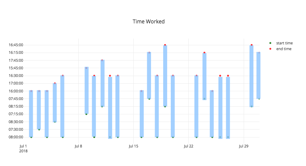
My code looks like this:
trace\_start = go.Scatter(
x=df.date,
y=df[‘stime’],
mode=‘markers’,
name = “start time”,
line = dict(color = ‘green’),
opacity = 0.8)
trace\_end = go.Scatter(
x=df.date,
y=df[‘etime’],
mode=‘markers’,
name = “end time”,
line = dict(color = ‘red’),
opacity = 0.8)
data = [trace\_start,trace\_end]
layout = dict(
title = “Time Worked”,
xaxis = dict(
range = [‘2018-07-01’,‘2018-07-31’])
)
fig = dict(data=data, layout=layout)
py.iplot(fig, filename = ‘Time Worked’)
---
### Author:  [@jmmease](https://community.plotly.com/u/jmmease)
#### Post date: [December 11, 2018, 11:10am UTC](https://community.plotly.com/t/create-bar-between-start-and-end-time-on-chart/16750/2 "2018-12-11T11:10:21Z")
Hi @pjford,
You can use the `base` property of the `bar` trace to control the starting height of bars in a bar chart. For example:
```python
import pandas as pd
import plotly.graph_objs as go
fig = go.FigureWidget()
dates = pd.date_range('2018-01', '2018-12', freq='MS')
fig.add_bar(x=dates,
y=[2, 3, 4, 1, 4, 5, 3, 4, 5, 3, 2, 3],
base=[1, 2, 3, 4, 5, 6, 7, 8, 9, 10, 11, 12])
fig
```

Note that in this case `y` is not the top edge of the bar, but the height above the bar’s `base`
Hope that helps!
-Jon
---
### Author:  [@pjford](https://community.plotly.com/u/pjford)
#### Post date: [December 11, 2018, 8:03pm UTC](https://community.plotly.com/t/create-bar-between-start-and-end-time-on-chart/16750/3 "2018-12-11T20:03:10Z")
This in theory seems like it would be a good solution, but when I run the sample code you’ve provided it runs forever and I have to restart jupyter notebook because it never finishes… any thoughts on what’s happening?
---
### Author:  [@jmmease](https://community.plotly.com/u/jmmease)
#### Post date: [December 12, 2018, 10:28am UTC](https://community.plotly.com/t/create-bar-between-start-and-end-time-on-chart/16750/4 "2018-12-12T10:28:47Z")
Hmm, no I don’t have any ideas.
Maybe something is going wrong for you with `FigureWidget`. Try displaying with `iplot` like you were originally:
```python
import pandas as pd
import plotly.graph_objs as go
from plotly.offline import init_notebook_mode, iplot
init_notebook_mode()
fig = go.Figure()
dates = pd.date_range('2018-01', '2018-12', freq='MS')
fig.add_bar(x=dates,
y=[2, 3, 4, 1, 4, 5, 3, 4, 5, 3, 2, 3],
base=[1, 2, 3, 4, 5, 6, 7, 8, 9, 10, 11, 12])
iplot(fig)
```
---
### Author:  [@pjford](https://community.plotly.com/u/pjford)
#### Post date: [December 12, 2018, 9:39pm UTC](https://community.plotly.com/t/create-bar-between-start-and-end-time-on-chart/16750/5 "2018-12-12T21:39:14Z")
Thank you so much! I was able to get your example running. I changed the format a bit to make it about time… and came up with this below.
I’m still doing something wrong as there are these problems:
1. The duration/bar-length is incorrect
2. The X-axis is not showing the Jul-4 entry
3. The Y-axis appears to be out of order… 8am, 730am, 815am…
4. The Y-axis does not go far enough up

```
import pandas as pd
import plotly.graph_objs as go
from plotly.offline import init_notebook_mode, iplot
init_notebook_mode()
fig = go.Figure()
btime = pd.to_datetime(['2018-07-02 08:00','2018-07-03 07:30','2018-07-04 08:15'])
timedur = [pd.Timedelta('8 hours'),pd.Timedelta('8.25 hours'),pd.Timedelta('7.75 hours')]
thedates = pd.date_range('2017-07', '2017-08', freq='D')
fig.add_bar(x=thedates,
y=timedur,
base=btime)
iplot(fig)
```
---
### Author:  [@Sasidaran](https://community.plotly.com/u/Sasidaran)
#### Post date: [August 17, 2021, 4:28am UTC](https://community.plotly.com/t/create-bar-between-start-and-end-time-on-chart/16750/6 "2021-08-17T04:28:53Z")
| Breakdown | Start time | End time |
| --- | --- | --- |
| 8:54 AM | 9:05 AM | 9:05 AM |
| 8:55 AM | 9:09 AM | 9:16 AM |
| 9:00 AM | 9:07 AM | 9:11 AM |
| 9:03 AM | 9:09 AM | 9:14 AM |
| 9:06 AM | 9:22 AM | 9:23 AM |
| 9:07 AM | 9:22 AM | 9:22 AM |
| 9:09 AM | 9:12 AM | 9:20 AM |
| 9:10 AM | 9:15 AM | 9:21 AM |
| 9:11 AM | 9:22 AM | 9:34 AM |
| 9:15 AM | 9:17 AM | 9:18 AM |
| 9:16 AM | 9:37 AM | 9:40 AM |
| 9:16 AM | 9:23 AM | 9:31 AM |
| 9:17 AM | 9:33 AM | 9:34 AM |
| 9:19 AM | 9:22 AM | 9:31 AM |
I have source file like this, how to generate chart that you shown, please help me get in ms excel or anything else
---
### Author:  [@Magnuss](https://community.plotly.com/u/Magnuss)
#### Post date: [August 24, 2021, 12:50pm UTC](https://community.plotly.com/t/create-bar-between-start-and-end-time-on-chart/16750/8 "2021-08-24T12:50:45Z")
Thanks for the information. I will try to figure it out for more.
[www.myaarpmedicare.com](https://www.myaarpmedicare.work/)